Rodarte
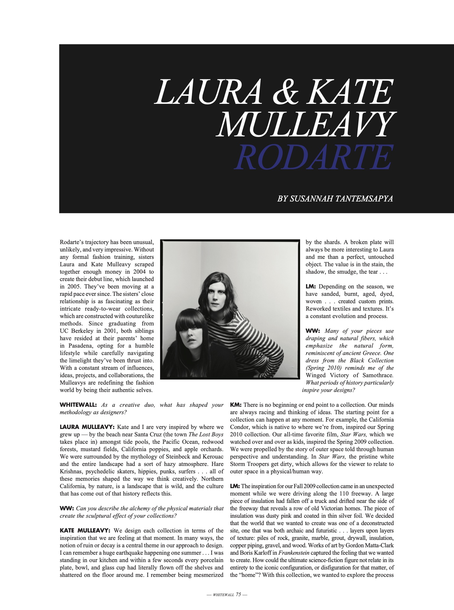
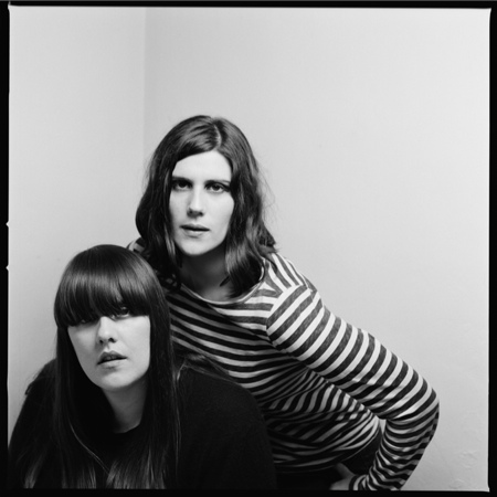
Laura & Kate Mulleavyby Susannah Tantemsapya Portrait by Erica Simon
Whitewall Magazine - The Fashion Issue
(Fall 2011)
Rodarte’s trajectory has been unusual,
unlikely, and very impressive. Without
any formal fashion training, sisters
Laura and Kate Mulleavy scraped
together enough money in 2004 to
create their debut line, which launched
in 2005. They’ve been moving at a
rapid pace ever since. The sisters’ close
relationship is as fascinating as their
intricate ready-to-wear collections,
which are constructed with couturelike
methods. Since graduating from
UC Berkeley in 2001, both siblings
have resided at their parents’ home
in Pasadena, opting for a humble
lifestyle while carefully navigating
the limelight they’ve been thrust into.
With a constant stream of influences,
ideas, projects, and collaborations, the
Mulleavys are redefining the fashion
world by being their authentic selves.
WHITEWALL: As a creative duo, what has shaped your methodology as designers?
LAURA MULLEAVY: Kate and I are very inspired by where we grew up — by the beach near Santa Cruz (the town The Lost Boys takes place in) amongst tide pools, the Pacific Ocean, redwood forests, mustard fields, California poppies, and apple orchards. We were surrounded by the mythology of Steinbeck and Kerouac and the entire landscape had a sort of hazy atmosphere. Hare Krishnas, psychedelic skaters, hippies, punks, surfers . . . all of these memories shaped the way we think creatively. Northern California, by nature, is a landscape that is wild, and the culture that has come out of that history reflects this.
WW: Can you describe the alchemy of the physical materials that create the sculptural effect of your collections?
KATE MULLEAVY: We design each collection in terms of the inspiration that we are feeling at that moment. In many ways, the notion of ruin or decay is a central theme in our approach to design. I can remember a huge earthquake happening one summer . . . I was standing in our kitchen and within a few seconds every porcelain plate, bowl, and glass cup had literally flown off the shelves and shattered on the floor around me. I remember being mesmerized by the shards. A broken platewill always be more interesting to Laura and me than a perfect, untouched object. The value is in the stain, the shadow, the smudge, the tear . . .
WW: Many of your pieces use
draping and natural fibers, which
emphasize the natural form,
reminiscent of ancient Greece. One
dress from the Black Collection
(Spring 2010) reminds me of the
Winged Victory of Samothrace.
What periods of history particularly inspire your designs?
KM: There is no beginning or end point to a collection. Our minds are always racing and thinking of ideas. The starting point for a collection can happen at any moment. For example, the California Condor, which is native to where we’re from, inspired our Spring 2010 collection. Our all-time favorite film, Star Wars, which we watched over and over as kids, inspired the Spring 2009 collection. We were propelled by the story of outer space told through human perspective and understanding. In Star Wars, the pristine white Storm Troopers get dirty, which allows for the viewer to relate to outer space in a physical/human way.
LM: The inspiration for our Fall 2009 collection came in an unexpected moment while we were driving along the 110 freeway. A large piece of insulation had fallen off a truck and drifted near the side of the freeway that reveals a row of old Victorian homes.
The piece of insulation was dusty pink and coated in thin silver foil. We decided that the world that we wanted to create was one of a deconstructed site, one that was both archaic and futuristic . . . layers upon layers of texture: piles of rock, granite, marble, grout, drywall, insulation, copper piping, gravel, and wood. Works of art by Gordon Matta-Clark and Boris Karloff in Frankenstein captured the feeling that we wanted to create. How could the ultimate science-fiction figure not relate in its entirety to the iconic configuration, or disfiguration for that matter, of the “home”? With this collection, we wanted to explore the process of building, ruin, and preservation.
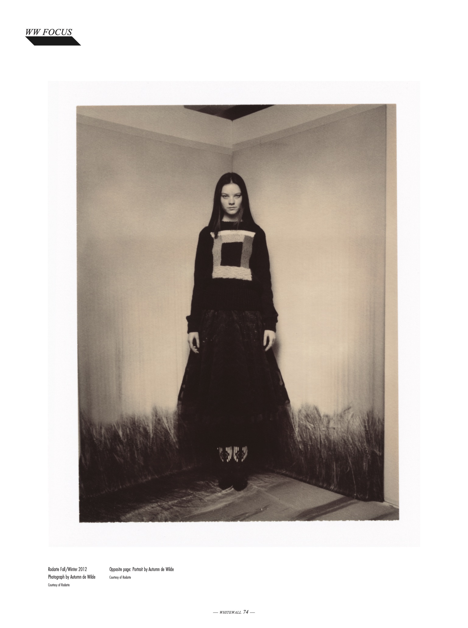
 Rodarte Fall/Winter 2012
Photography by Autumn de Wilde
Courtesy of Rodarte
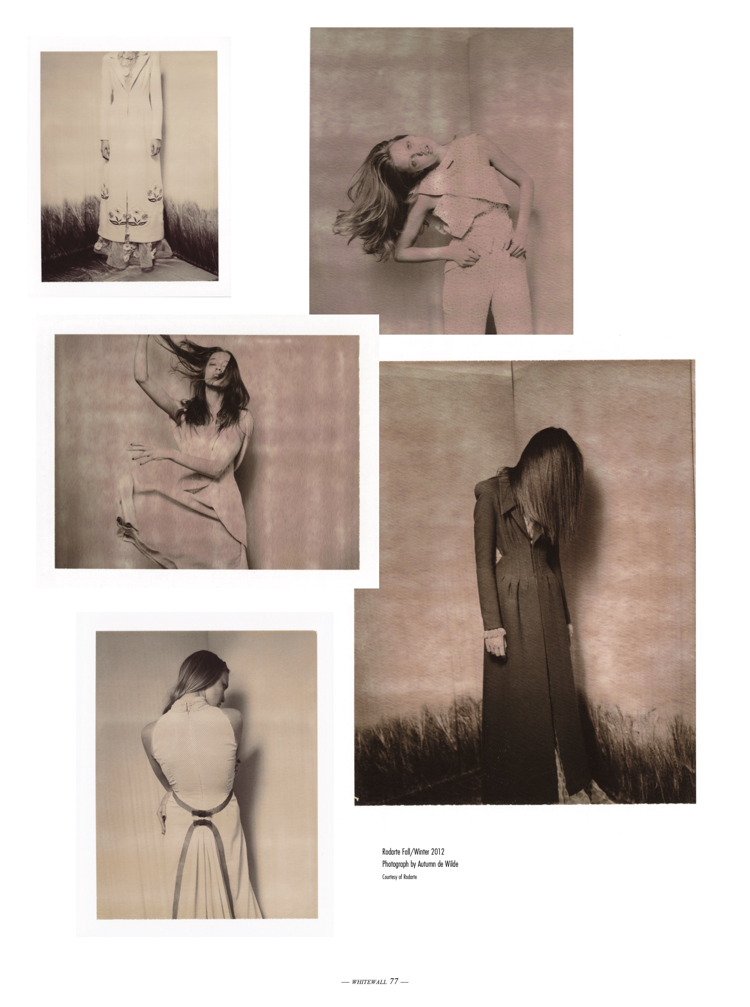
Rodarte Fall/Winter 2012
Photography by Autumn de Wilde
Courtesy of RodarteUpon seeing our collection completed, we began to see its connection to the arid desert
landscapes that we had grown up with. Joshua Tree National Park, whose dominant geological feature is of bare rock, broken into loose boulders and stacked into piles upon piles, is also speckled with the most charismatic and delicate trees known in existence. The combination of fragile sand tones and strange green hues acts to magnify the contrast between the park’s severe desert landscape, with its bizarre flora and fauna. How does a seemingly prehistoric world seem to remain so preserved and perfect — so desolate and isolated — in the middle of California? The horizon is marked by spectacular rock sculptures and relics of an earlier time, perhaps a time where lizards were a thousand times larger than they exist today. Every surface is broken and mangled. The trees create arms frozen by an advanced stage of arthritis. Bodies are no longer perfect, but look as though they are altered by the wondrous world where everything that you know seems to be questioned and disfigured.
WW: This past Spring, “Rodarte: States of Matter” opened at the
Museum of Contemporary Art in Los Angeles. There’s the dark
freedom of the black room on the lower level; then ascending the
staircase, the white room starts out more oppressive and becomes
progressively more open by facing the Red Collection (inspired
by Japanese horror films). What was the intention behind the
exhibition?
LM: We wanted to bring people into a world where they were
immediately confronted by a series of multiples dressed in black,
as if the pieces were part of a dialogue, rising out from a blackened
void. The room is a contained space,smaller than the upstairs
environment. In a way, the space itself helped direct which pieces
we used in the show, and also where we placed them. Black is
a color that absorbs light, and in showcasing the black pieces
downstairs we were able to create an intimate and secluded
atmosphere. Upstairs, we played with the amount of light in the
room, which was both natural and artificial (from neon lights). The
white multiples are more ethereal and worked so well in a larger,
less confined context.
WW: There is a tremendous crossover of contemporary art, film,
music, and science in Rodarte, including numerous collaborations
with artists such as Ryan McGinley, Todd Cole, and Darren
Aronofsky. How have these relationships enhanced your creative
process?
LM: Every collaboration is different and special in its own way. For example, we met with Darren Aronofsky in Brooklyn after Natalie Portman suggested that we would be a good fit for designing costumes for Black Swan. We prepared for weeks before our first meeting, researching the ins and outs of the ballet world and the history of its participation in the discussion of voyeurism. No matter what beauty the audience longs to see, there is still the brutal training, body disfiguration, and backstage reality that make ballet so complex. The story of Swan Lake unfolds as a tale of the transformation of the maiden into a swan and then mutates again into a tale of mistaken identity. We were inspired by the idea of metamorphosis, specifically the dichotomy between perfection and decay.
LM: Every collaboration is different and special in its own way. For example, we met with Darren Aronofsky in Brooklyn after Natalie Portman suggested that we would be a good fit for designing costumes for Black Swan. We prepared for weeks before our first meeting, researching the ins and outs of the ballet world and the history of its participation in the discussion of voyeurism. No matter what beauty the audience longs to see, there is still the brutal training, body disfiguration, and backstage reality that make ballet so complex. The story of Swan Lake unfolds as a tale of the transformation of the maiden into a swan and then mutates again into a tale of mistaken identity. We were inspired by the idea of metamorphosis, specifically the dichotomy between perfection and decay.
WW: How did the Spring and Fall 2011 capsule collections for Opening Ceremony come about?
KM: The Rodarte for Opening Ceremony collection is a celebration of our home state of California. We went to UC Berkeley with Carol Lim and Humberto Leon of Opening Ceremony, so we’ve known each other for years. We had always planned on collaborating on a special project together, so this collection is really about friends coming together to create something special.
WW: This summer you’re designing a capsule collection as special guests for pitti W in Florence, Italy (along with Band of Outsiders). Your grandmother is from Rome — did that relationship influence this collection at all?
KM: We’re honored to be asked to show in Pitti. Our grandmother
has always influenced us. She was an opera singer and in many
ways taught us to love the things that we find interesting and
powerful.
LM: We had an incredibly close relationship with her, and we
suppose that has influenced everything that we have done.
WW: Can you tell us about your upcoming book with Catherine Opie and Alec Soth? I’m especially intrigued by the California road trip by Soth for this project.
KM: Cathy shot long-term subjects like Idexa, Jenny Shimizu,
Kate Moennig, and friends of ours like Guinevere Van Seenus and
Susan Trailer. She shot each subject against a backdrop of
a specific color, and we worked to pick pieces from our collections
that would interact with the colors being chosen. Each portrait
conveys an intense sense of intimacy with the subject that only
a Catherine Opie picture can do. Catherine worked separately from
Alec, but there ended up being a real tangible dialogue between
[both] the works.
LM: Kate and I made Alec a list of all the things that inspired us in
California, and he spent two weeks on a road trip photographing
them. We felt that the landscape of California was pivotal in telling
the story of our clothes. It was interesting, because he was asked
to document things that interested us and have influenced our
creative process and aesthetic, and in this manner that’s how we
got to know one another. It was as if we were pen pals. We titled
the book Rodarte, Catherine Opie, Alec Soth because, in the end,
all of our work resulted in a narrative.
WW: What is “American Couture?” How does Rodarte fit into this movement?
KM:
Everything that we create comes from a personal place and is executed with a delicate hand. We believe in the power and beauty of artisanship and artistic integrity. Every detail of our garments reflects this. For Fall 2011, we were inspired by the pastoral beauty of the Great Plains, particularly seen during the golden hours of dawn and dusk. The flatness of the prairie and the expansive horizon line influenced the aesthetic development of our collection. The first thing we thought of for our Fall 2011 show was Terrence Malick’s film Days of Heaven. The idea of light and how it creates vistas and transforms the environment is a central theme in the collection. We wanted to show how light is distilled, transfused, and illuminated in a field of wheat throughout the day, so we transformed these varied landscapes into the form of five dresses. We started with dawn — a pale yellow, like a sunrise. Then we did a midday print with a blue sky and roaming clouds, and thirdly, a dusk print with twilight tones. Our final dresses in this series referenced The Wizard of Oz. We created two stormy versions of the wheat field based on the opening of the film, which is in black-and-white, and the rest of the film, which changed to Technicolor.
- Print -